
Well, what a week it’s been! I’ve been eating, drinking, breathing, and dreaming blog design for the past five days. We started this project back in mid-October. I was told it would be done around the holidays, haha!
This ain’t my first rodeo, and I KNEW it would be a lot longer than that, but I was hoping maybe we would have the new site up and running by the end of January. I guess mid-February isn’t so bad, all things considered.
I’ve been getting questions from bloggers and non-bloggers alike, so I thought I’d use this post to talk a little about the process, my goals, and why I wanted a new design.
Why did you want a redesign? Your blog looked nice before.
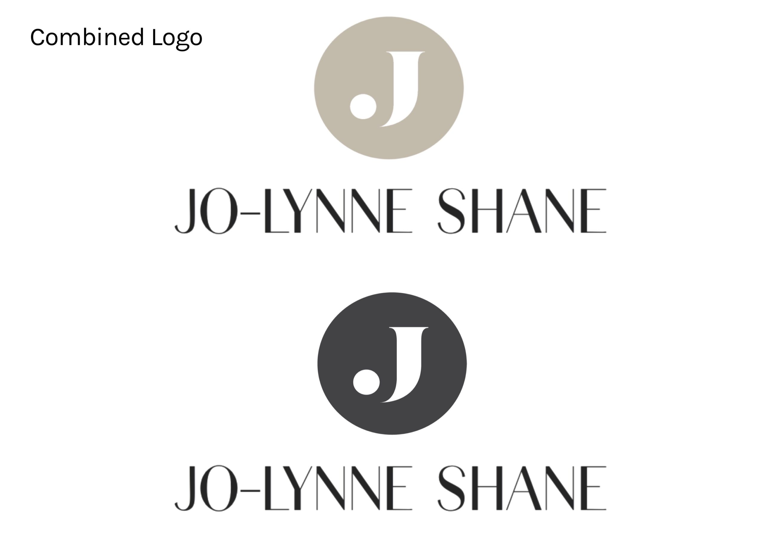
I always get that question when I do a blog redesign, lol! I was very happy with my design before. I worked with Lindsey at Purr Design — she is the one who created the J logo that is now very much part of my brand. While we didn’t use it in the masthead on this design, we are incorporating it other places. Lindsey has a great eye for logo design and branding, and I still love the brand and style guide she created for me back in 2017.
She updated my site several times after that, and I was always pleased. But Lindsey works mostly with food bloggers, and as my blog and website technology has evolved, I wanted some functionalities that are unique to fashion blogging. And also, I just felt like it was time to get a fresh perspective.
Who designed your new site?
I’ve been working with Smash Creative on this website upgrade, and overall I’m very pleased. They have a different process than any blog designer I’ve used before. In the past, I’ve always gone to a designer who is more or less a one-man show. (Or, in my case, a one-woman show.) Usually it was someone who has a unique style that I’m particularly drawn to — most blogs have a link to their designer in the footer, so you can figure out who they used.
Smash is different because they are a small company with a team of designers and developers, and all of my communication has been with an assigned project manager. So basically, I communicate with the project manager, and he orchestrates everything going on behind the scenes. We met on Zoom several times throughout the process to hammer everything out, and that screen share feature was such a life saver. It’s so much easier to explain things when you can see it.
What was the process?
Smash Creative actually approached me about the possibility of upgrading my website, back in October. I was kind of hankering for a new look and some of the new features I was seeing on other fashion blogs, but it’s a big financial investment to do what I wanted to do, so I had been dragging my feet. I had even reached out to a couple of the design studios I admire, but one never responded and the other had closed her wait list, she was so overwhelmed with requests.
So when Angela at Smash Creative reached out, I scheduled a call. I figured, it couldn’t hurt to chat. As it turns out, they did Cyndi’s blog and also Susie Wright’s, so I was able to see their work.
I liked what I saw, and I liked what I heard about their company when we talked, so I decided to go for it. I was also thrilled that there was no wait list. Since they have multiple designers and developers on their team, they were able to start the design process right away. I filled out the questionnaire about my brand and what I was looking for, and we got on our first Zoom call to discuss strategy, goals, and vision for my blog. From there, the ball was rolling!
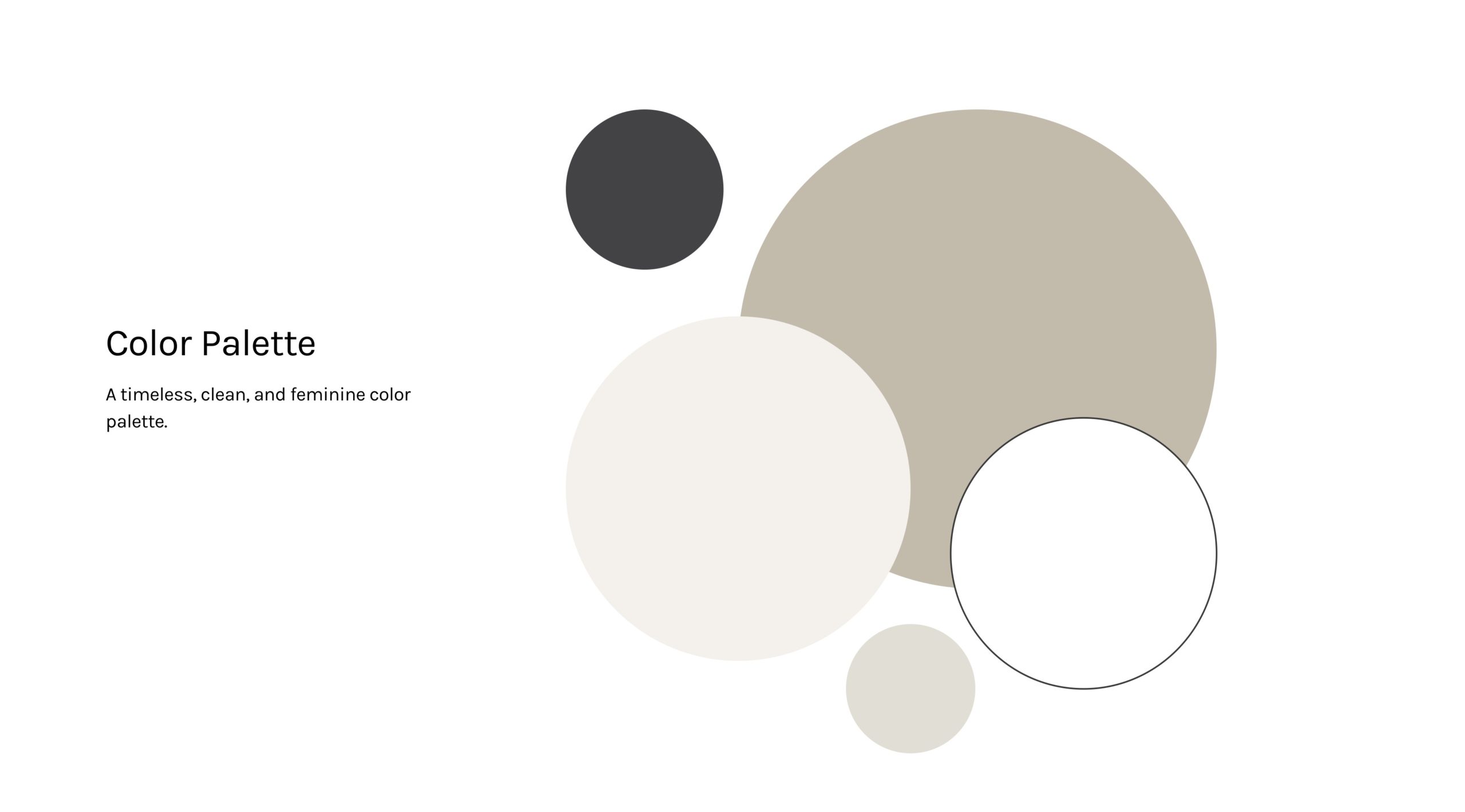
Next was the Brand Meeting with the designer assigned to my project. That’s when we discussed branding, colors, and the overall look and feel I wanted. We met again a few weeks later to go over that. I liked it, but I wanted the colors tweaked a bit, so after some back and forth, she sent my final Brand Guide with colors and fonts and my updated logo design.
Once I approved that, she set to work on the blog’s homepage design.
Now that we had a plan, I was dying to see it come together, but that was right before Thanksgiving, so I knew I would need to be patient.
Imagine my surprise when just a few days later, Kelcie had the homepage ready for me to take a look at! It was just a picture, but she was able to talk through it and discuss the features and how it would work. A few days after that, she had some of the other pages ready to look at, including the mobile site.
Everything seemed to be moving along pretty quickly, but there was a lot of back and forth and questions and tweaking. Finally, the week after Christmas, we had all the blog design elements hammered out, and I was moved over to the development queue. (For anyone not familiar, development is when they take all the designer’s pretty plans and pictures and make them actually work on a real, live website.)
That’s when everything slooooowwwwwed doooowwwwwwn.
There was a bit of a wait for the development team to take on my project, and then that whole process took longer than expected, but finally on February 4, I was able to look at a live mockup of my new site!
That was exciting, but made me even more anxious to see my own content in there and having it live and working for everyone to use and enjoy. I was afraid it would be another month before they were able to install on my blog, but after we went back and forth about a few things, they surprised me this past week by suggesting we install on Thursday.
Thursday was a loooong day, and as you know, my blog was offline for most of it, but I am thrilled with how everything turned out.
My New and Improved Website!!!
There are some glitches (particularly on mobile — that is always the most challenging part) and we’re still working on ironing out the kinks, but overall, I’m very happy with the end result and the process of working with Smash Creative.
I have a list a mile long with little details I want tweaked or added, but I hope to get those taken care of early this week. There are some spacing issues, I want to make my comments easier to find, add some dates, and other assorted things.
I can’t wait for tomorrow to get this ball rolling again, but every time I open my site, I am so pleased. I love the color palette, the fun new features, and the updated look.
In the meantime, there is a lot I can do behind the scenes, plus it has been quite a project to upload all the products for the Shop page. Those also populate Jo-Lynne’s Picks, the Popular Right Now feature on the sidebar, and the shoppable links on each of my posts.
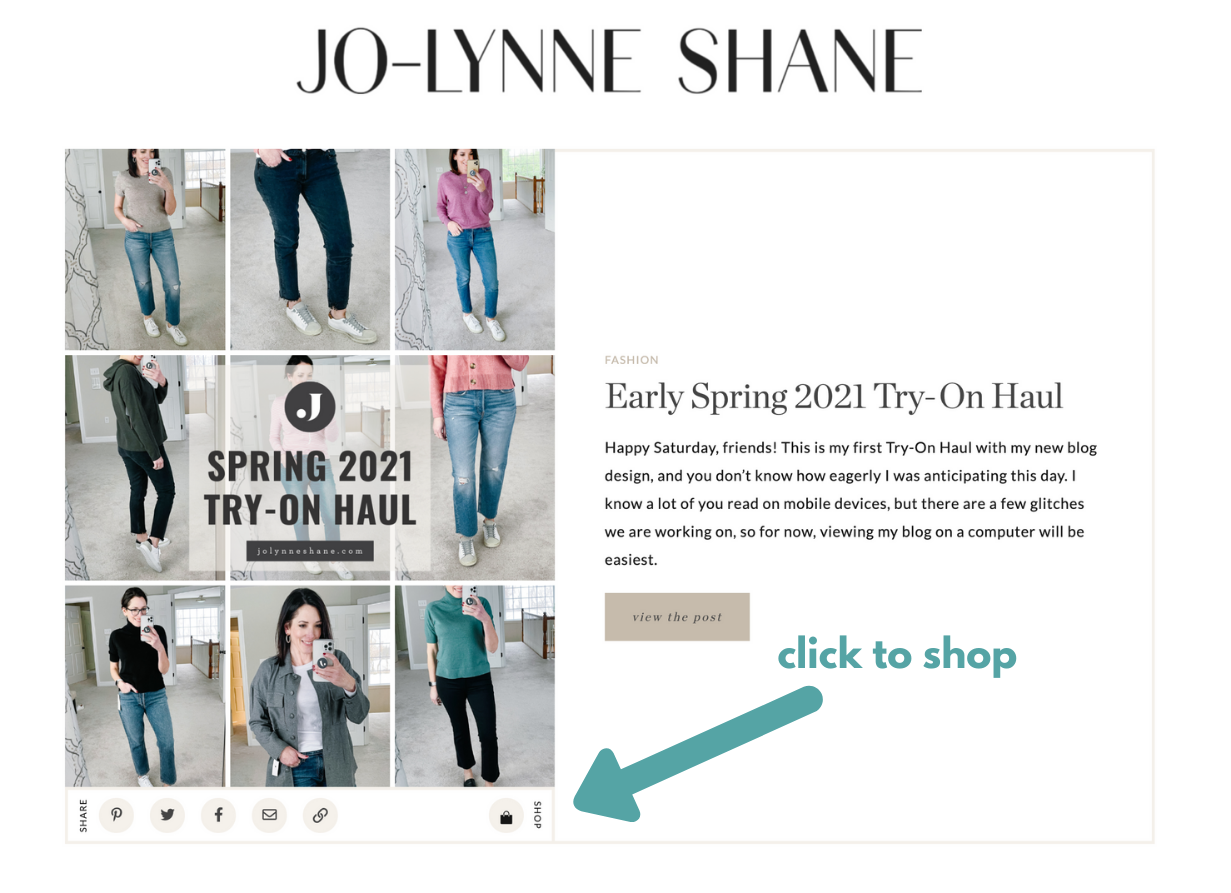
FUN FACT: If you hover over the little SHOP icon a the bottom right of the image on the home page, it brings up shoppable images from the products featured in the post.
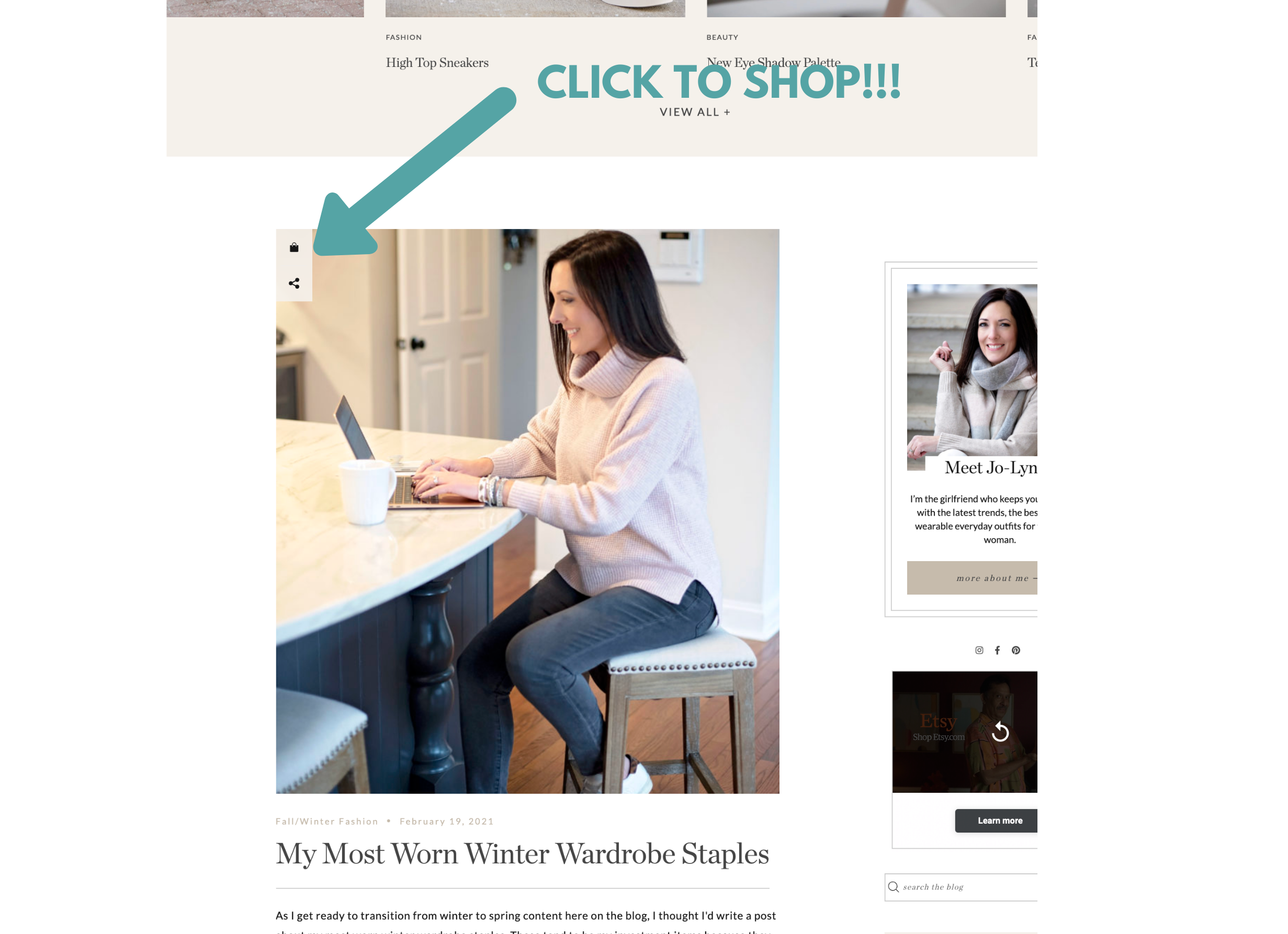
And on the posts in the middle section, that SHOP icon is on the top left.
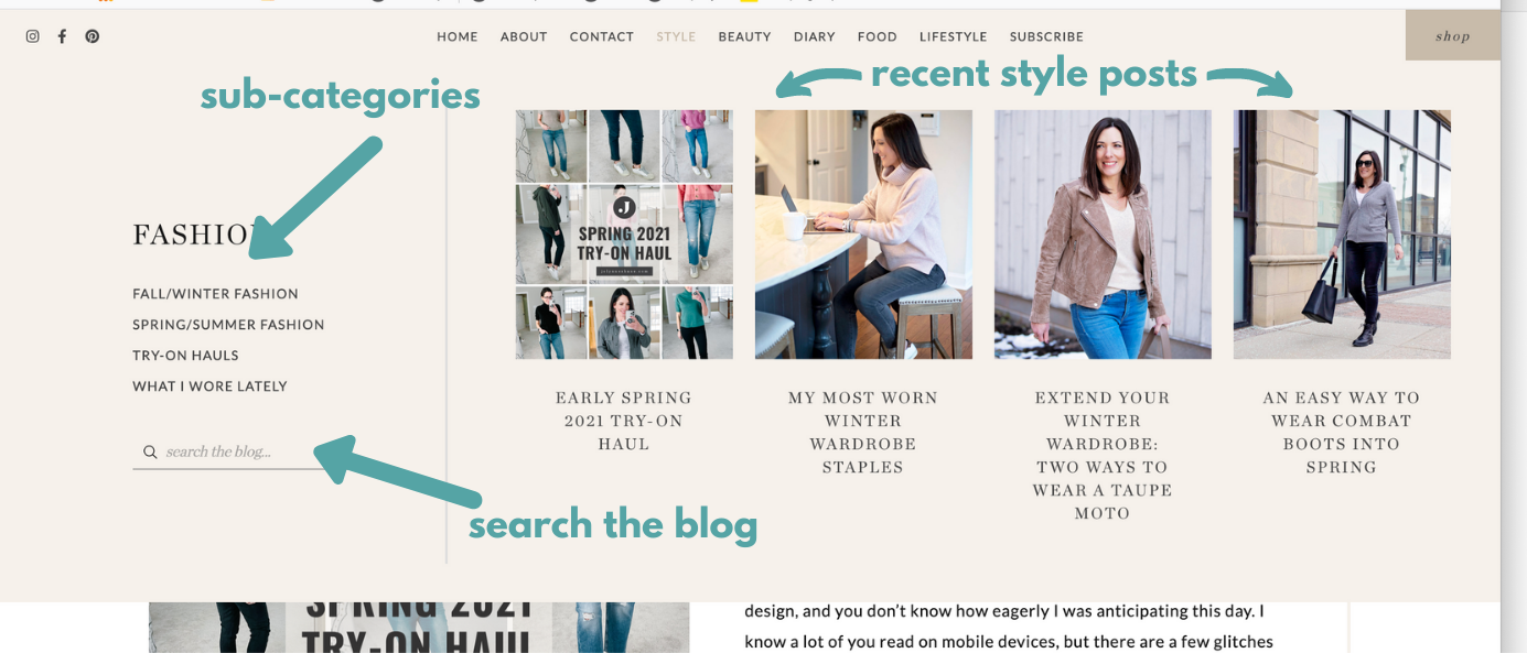
I tried to keep the new design pretty straightforward and intuitive. For example, I hate it when I go to a blog, and I can’t figure out where to find the most recent posts.
My home page is still my most recent posts, in reverse chronological order. There are just a few other features sprinkled in.
This Currently Loving section was one of Kelcie’s suggestions. A lot of bloggers are using these “Snapshots”, as they call them, as mini-posts or call-outs for certain products.
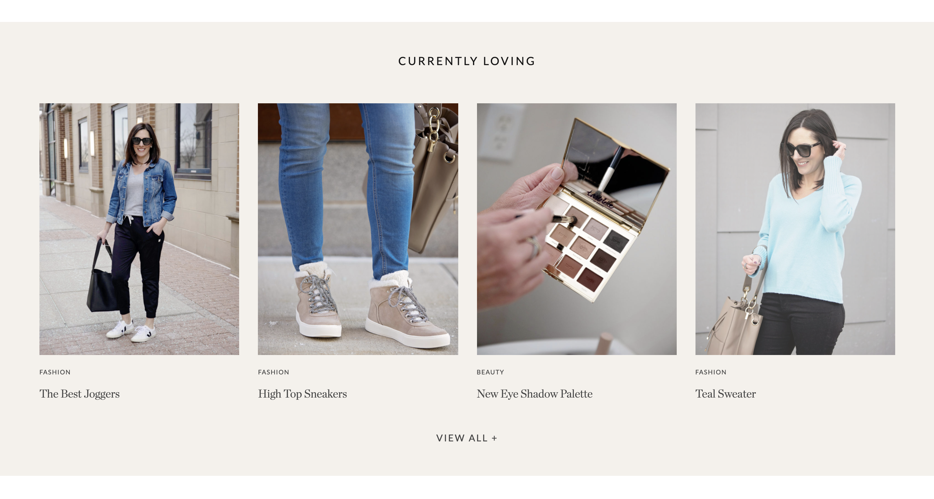
I’m still figuring out how to best utilize this feature. Each of those images is clickable, and you will get some more details about the items featured there. Click View All + to see all my Snapshots. (I obviously need to add more!)
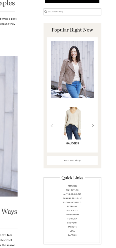
The sidebar has a Popular Right Now section, where I can call out specific products or posts that are trending. A search bar is directly above that, and I have some Quick Links to popular retailers below it.
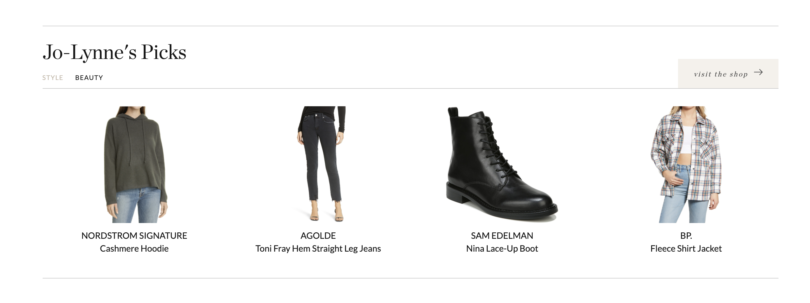
And then further down the page, there’s a section of my top product picks, and you can click through to see the rest of my Shop section — which I have divided up by category, but I can also add pages for specific retailers as well.
Another fun new feature I’m loving is the expandable menu bar at the top. I put my most popular categories up there, and when you hover, there’s a dropdown with my most recent posts in that category, and links to the subcategories and a search bar to the left.
There’s probably more, but I think that hits the highlights. If you have any questions or suggestions, feel free to let me know, either via email or in the comment section.
If you have issues, feel free to email me. A screenshot always helps, and let us know if you are on mobile, desktop, tablet, etc. Even the browser you are using can be a factor. I am gathering all of these in a list to send to Smash. They are going to LOVE me tomorrow, haha!
Enjoy the rest of your weekend!


21 Responses
Hi Jolynne,
Your website looks beautiful!! I first saw it on my mobile phone and your right on a computer it does navigate
differently. Love the colors and design are very modern. We are also in the process of updating my husbands website page for his business and in the beginning stages of getting the logo to our liking. We have not done anything for many years ,so I can’t wait as well to see a more modern look for his business. Thank you for sharing your experience with us and your webpage. It is exciting for a fresh look!
Best of luck!
I hope it goes well for him!
I like the new color scheme and overall look of the redesign!
I normally read your site on an iPad and the redesigned site feels less user friendly on my iPad. In particular, the video ads rolling along the side are pretty distracting. (I’m sure they are designed to be distracting to get people to click 😀, but it almost makes me dizzy to see those in my peripheral vision while I’m trying to read your content.) On today’s post, I counted like something like 6 ads mixed in with the blog post, plus a pop up ad (not a subscribe pop up) at the bottom that I had to close out of to read the full page, and a regular and video ad on the side. I checked on my laptop and the experience is better there – a couple less ads and more readable space in the main section of the page), but that’s not typically where I read blogs.
Hey, Jen. Thanks for that feedback. I don’t have an iPad so I can’t see what you all see, so your input is helpful. My ad network is separate from the design team, but they are very responsive and can tweak things quickly and easily. There shouldn’t be more ads per post, but maybe they are spaced closer together b/c the font size changed. I will ask them. I’m always trying to find a healthy balance with the ads. The one at the bottom has always been there, but it can be Xed out of. There is the option not to allow them to be closed, and they pay more, but I declined that option. I will definitely ask them about having the ads spaced out more and fewer ads per post.
The first time I clicked on your new website I was inundated with flashing ads and “sign-up” screen covers. Today it is much nicer, so I guess that means you’re getting the kinks worked out. My son in CA does this type of work, so I know how involved it is. Your site looks great, and I love your blog. I’ve been a regular reader for 7 or 8 years.Thanks for all you do!
Thanks, Sylvia. Yes, these things can all be tweaked, the feedback is helpful! Thanks for your patience. 🙂
Beautiful new design. I had trouble finding the comments the other day, but watched your Instagram tutorial and that really helped. When learning something new, I need to be patient. At my age, I need to remember that! I am using an iPhone and I really tempted to search out your new elements on my laptop. Enjoy your day!
its me again. Just an fyi, in trying to see your sight on my laptop. Your new subscriber box covers the post so I had to try to subscribe in order for it to go away. So I did. Then it tells me that I am a subscriber to I need to see if I am a robot. I proved I was not a robot, it then went away so I could navigate through your site. The site also keeps blinking off ever few minutes but them comes right back. I use safari. I hope this helps.
Hey Carol, sorry about that. What a pain. I am going to get rid of that subscriber popup altogether. Although I will say, it must work, as I’ve had a bunch of new subscribers this weekend, haha! Still, it’s annoying to my regulars, so it must go.
The site blinking is concerning. I will have them look into that.
Hi Jo-Lynne!
Thank you for sharing- whaT a lot of hard work! (I’m on an ipad- wHich explaIns the aLl capital letters! ) i love the new look! I do agree with others that sidebar ads seem to be a bit more prominent, but it sure wont stop me from checking for your post first thing every morning! I love your attention to detail and have purchased many things From your recoMmendations and through your liNks. Hope you can grab a Sunday Rest!
What an awesome overview of your new blog design! Because I spent many years in the marketing department at The Coca-Cola Company, a lot of what you shared brought back memories. I am glad that you found such a wonderful and inclusive agency to work with. And of course, I see that our comment and I for is no longer in ALL CAPS. That was a quick fix. We are being blessed with another sunny and beautiful winter day here, all be it very windy. I’ve got 7 can soup in the slow cooker for dinner tonight, thanks to @Kay Harms for the recipe. I hope that you have a wonderful afternoon.
I find this fascinating. So glad you shared…I think this is one of the perks (and expenses) of being a big time blogger… (though I’m sure you spent plenty of years in the trenches being a DIY designer). But as you all go, so eventually do the rest of us, even the small hobby people like me. And just as you ID the fashion trends, you also share the design future for the rest of us.
It looks great! Thanks for sharing the process!
Beautiful. Elegant. Modern.
Nicely done!
Jo-Lynne, I noticed the changes to your site right away. It is beautiful! As a blogger who has to do all my own tech at this time, I love to see professionally designed sites. Yours is just fantastic. I hope you enjoy working with it as much as I enjoy looking at it!!
Hi! I like your new design because you seem to be happy about some of the new features. I liked the old one too! It looks the same on my MacBook and also in my iPad air2 (an antique by now haha) I didn’t have the problems with pop up ads like other readers experienced, but that may have something to do with my browser. I use Brave which blocks much of that. The ONLY thing I don’t like is that the email sign up pops up every time, I’m already signed up so I find that annoying, I think you did mention that you were going to get rid of that though? I love your site – it’s become my favorite! I especially like the way you engage with your readers in the comments section. Those are fun to read and I usually glean more info that way. Wishing you continued success! You certainly have my support😊
It really does look so good. It makes my head swim just reading and thinking about it. This is something I really would like to think about and should do sometime soon. Congratulations! XO
Congrats on your new website. Using my cell phone to access blog posts from emails. With the new version, I immediately see a pop up that asks me to join your list, odd since I accessed the blog from the email. Are they working on correcting this, it is a bit annoying.
Yes. I am asking them to take that down. 👍🏻
The new colors are so nice. The ad at the bottom takes up about 1/5 of my laptop screen and constantly changes like a video stream which is distracting. Frequently it shows a montage of jewelry which I can’t tell if it is part of your post or not. I can ‘hide’ the ad but if I click to a different blog post it comes right back. I am constantly turning it off when I am on your site and it seems to come right back. I know you need the ads but that is my one pet peeve of your site.
Thanks, Ann. I’ll talk to my ad network and see what options there are.
Love the green utility jacket and light gray mix on you! So excited your site is done. What a process I’m sure! Travel Tips by Laurie